Err... to R! - Visualisation
Thoroughly suitable ways of reporting data.

There is a quote that I came across at the Science Museum and has quickly become my new favourite:
Everyone knows that numbers are thoroughly unsuitable for spreading statistical knowledge.
- Marie Reidemeister
Whilst tables have their place in conveying information, they should be used sparingly and only when necessary. Through effective visualisation and reporting we enable the easy digestion and understanding of our analysis. If we cannot get our target audience to engage with and understand our results then the analysis has been a waste of time. If the audience is other data practitioners then our task is easier, however oft times we have to be able to convey our insights in a way that focuses upon the interpretation of the results not just the results themselved. One such way is through visualisations.
In previous posts we have covered the mechanics of manipulating data in R, however the output has been purely code. Whilst this is becoming understandable to you, there are many who will not understand and therefore ignore it. As such, let us cover how we can visualise our results and report on them. The primary focus shall be around exploring visualisation, but we shall describe some of the reporting tools that R has so you are aware and can explore independently.
Visualisation
Plots are the core way in which we can visualise information within data, and can be used to understand the data we have at our disposal as well as the results of our analyses. Before we create plots let us first address a topic we broached in the previous section.
Vanilla vs. Tidyverse
Within the tidyverse there is a package called “ggplot2” which creates plots in the “grammar of graphics” building plots as layers. In Vanilla R we can create scatterplots using the aptly named plot(), histograms using the function hist(), barplots using the function barplot() and so on. In ggplot2 we create a base plot and add layers on top providing greater flexibility - albeit at the expense of simplicity.
Similarly to the previous section with dplyr, ggplot2 is a better plotting system to learn and we shall introduce it in a way that lessens the learning curve. Let us begin with the mtcars data set from the previous section:
plottingData <- mtcars %>%
  as_tibble %>%
  mutate(`Car Names`=rownames(.))
ggplot
We create the base for our plots using the function ggplot() like below. The image isn’t a mistake as we have just created the canvas on which we are going to build.
ggplot()
A great benefit with ggplot is that we can store the plots as variables so the image is only shown when we call the variable:
basePlot <- ggplot()
class(basePlot)
## [1] "gg" "ggplot"It also means that if we want to store the plot midway we can do so and create another plot with further additions such as lines on a plot, annotations etc. Within ggplot the types of plots are called geoms and there are a multitude of geoms to create different plots with some people creating more through additional packages. There are too many to cover in this post, however the methodology is the same albeit with some additional parameters in each geom, but the syntax differences can be easily identified using our problem solving skills. Let us start by creating a scatterplot to illustrate the syntax for ggplot.
Scatterplot
Within each geom there are two main parameters our data and our aesthetics; “data” is the dataset from which we want the geom to build, and the aesthetics - aes() - are our axis variables, colour of the points and more - the aesthetics are the parameters that change the most between geoms. The geom for a scatterplot is geom_point(), let us build a simple scatterplot on top of basePlot with our x axis being “mpg” and our y axis being ‘hp’.
basePlot +
  geom_point(data=plottingData,aes(x=mpg,y=hp))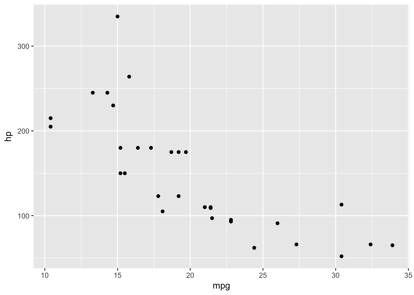
As before, variables defined within the aes should be done without quotes and as outlined previously we need to take care with variable names that have special characters in the way we described. We combine layers using ‘+’ instead of the pipe - %>% - because as Hadley Wickham (the creator of ggplot) once pointed out, ggplot2 was not designed with the pipe as a functionality.
Now let us change the colour of the points to green. There is an aesthetic called “colour” so let us change that now.
basePlot +
  geom_point(data=plottingData,aes(x=mpg,y=hp,colour='green'))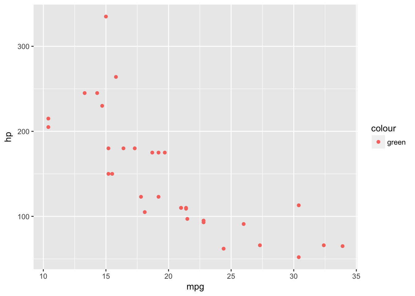
This hasn’t worked because anything defined within the aes() looks for a variable in our dataset. If we try it without the quotes we will get an error.
basePlot +
  geom_point(data=plottingData,aes(x=mpg,y=hp,colour=green))
## Error in FUN(X[[i]], ...): object 'green' not foundBut if we put it in quotes outside the aes() it will work fine.
basePlot +
  geom_point(data=plottingData,aes(x=mpg,y=hp),colour='green')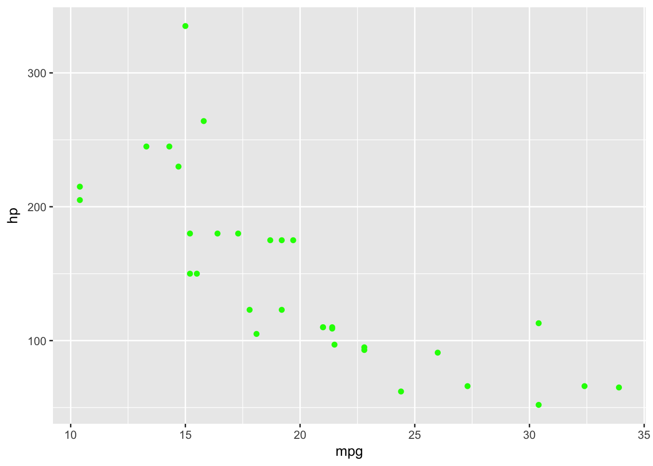
We can use strings to define colours that exist within R - which we can find out using the function colours(). We can also use hexadecimal definitions to define colours as follows - ColorHexa is a great resource to aid in defining colours in hexadecimal format.
basePlot +
  geom_point(data=plottingData,aes(x=mpg,y=hp),colour='#BD0026')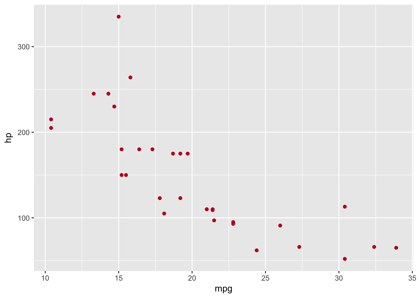
It’s not only the colour we can change within our aesthetic, we can find the changeable aesthetics using the help documentation - ?geom_point.
Let us now create an example which illustrates some of the aesthetics we can use in geom_point(). It also highlights the variable requirements for some aesthestics, such as the fact we had to change cyl to a factor because the shape aesthetic does not work with continuous variables. These cases arise as errors when we try to build the plot. Whilst a plot should never be this busy, it illustrates another benefit of ggplot over base plotting which is the legend is created automatically.
basePlot +
  geom_point(data=plottingData,aes(x=mpg,y=hp,size=disp,colour=wt,shape=as.factor(cyl)))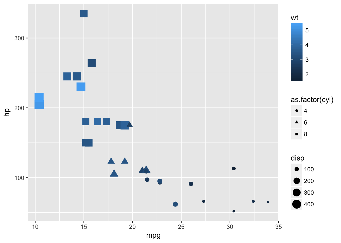
Layering
Before we move onto another type of plot let us demonstrate the addition of layers within ggplot. Say we want to add a line that illustrates the mean of hp and the mean of mpg on the plot, we can do this with geom_vline and geom_hline. We will use a simpler plot to illustrate this. The pch arguement defines the plotting character that we are going to use, some of which have an outer - colour- and an inner - fill - which can be specified inside or outside of aes. A list of the primary plotting characters can be seen at the bottom of this section. If there is no outer and inner component we specify the colour as we did previously.
basePlot +
  geom_point(data=plottingData,aes(x=mpg,y=hp,size=disp),stroke=1,fill='green',colour='black',pch=21)+
  geom_vline(data=plottingData,aes(xintercept=mean(mpg)))+
  geom_hline(data=plottingData,aes(yintercept=mean(hp)))
Notice that in the previous plot the lines are placed on top of the points, which isn’t ideal. This is because we added the lines layers after the point layer. If we change the order in the creation, we change the order of the layers in the visualisation.
basePlot +
  geom_vline(data=plottingData,aes(xintercept=mean(mpg)))+
  geom_hline(data=plottingData,aes(yintercept=mean(hp)))+
  geom_point(data=plottingData,aes(x=mpg,y=hp,size=disp),stroke=1,fill='green',colour='black',pch=21)
The fact that we can specify the data for individual geom’s aesthetics is really useful if we are dealing with multiple datasets, but if we are using just one we can save ourselves some code by placing the data in the base function. We can also define default aesthetics in the base ggplot function - although they are usually better defined within each geom.
ggplot(data=plottingData)+
  geom_vline(aes(xintercept=mean(mpg)))+
  geom_hline(aes(yintercept=mean(hp)))+
  geom_point(aes(x=mpg,y=hp,size=disp),stroke=1,fill='green',colour='black',pch=21)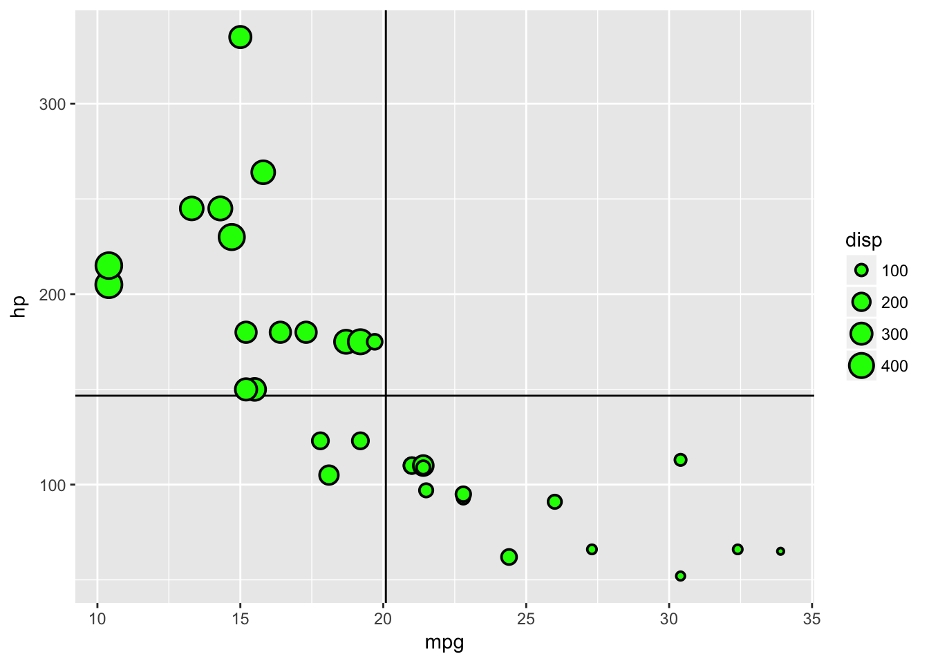
Primary Plotting Characters
The plot below illustrates the primary plotting characters you can use, however through additional packages and searching you can find these are not the sole characters we are limited to.
pchData <- tibble(x=rep(1:5,5),y=sort(rep(1:5,5))) %>% mutate(pch=1:n())
ggplot(pchData)+
  geom_point(aes(x=x,y=y),fill='green',colour='black',size=2,pch=1:25)+
  geom_text(aes(x=x,y=y,label=pch),nudge_x = -0.2)+
  theme_void()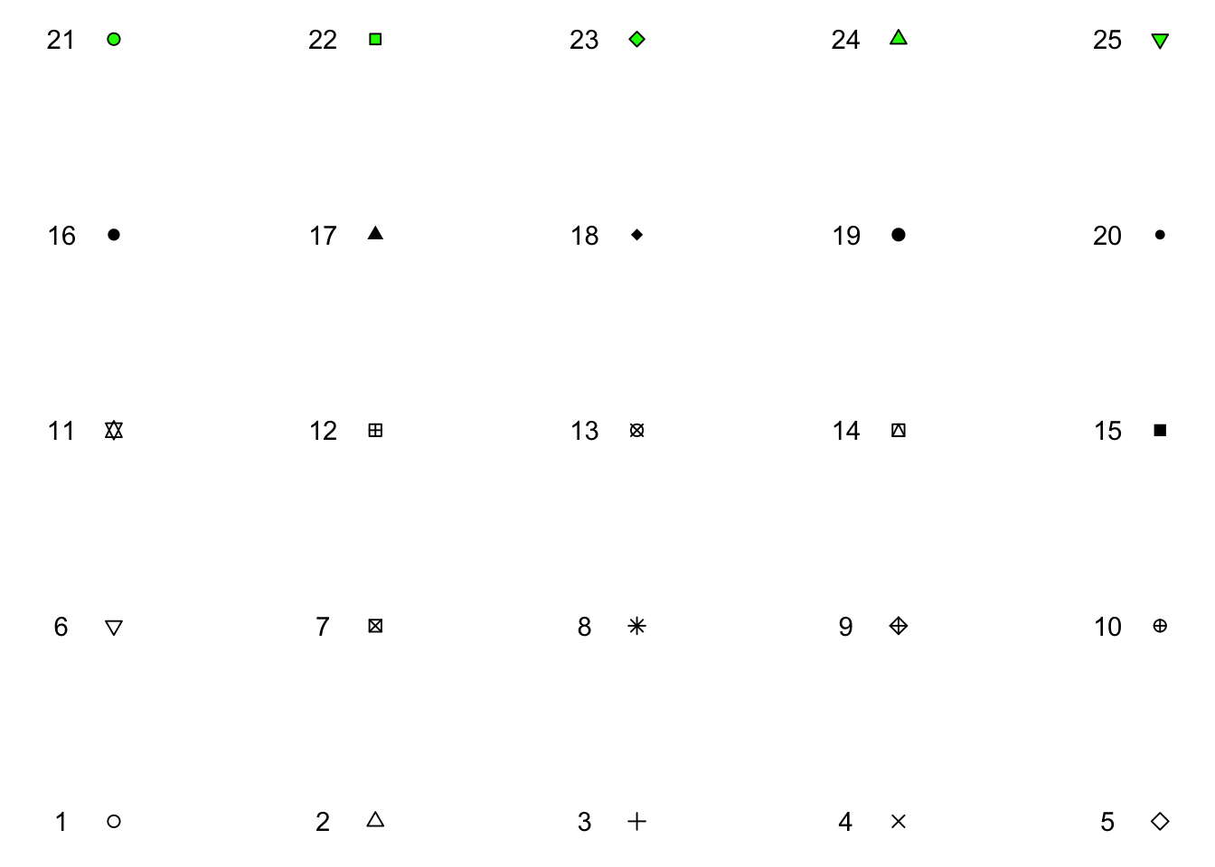
Histogram
An example of specific parameters within a geom is the histogram. It is straightforward enough to plot a histogram as it only has one variable to define and we will continue to use mpg as our x variable.
ggplot(data=plottingData)+
  geom_histogram(aes(x=mpg))
## `stat_bin()` using `bins = 30`. Pick better value with `binwidth`.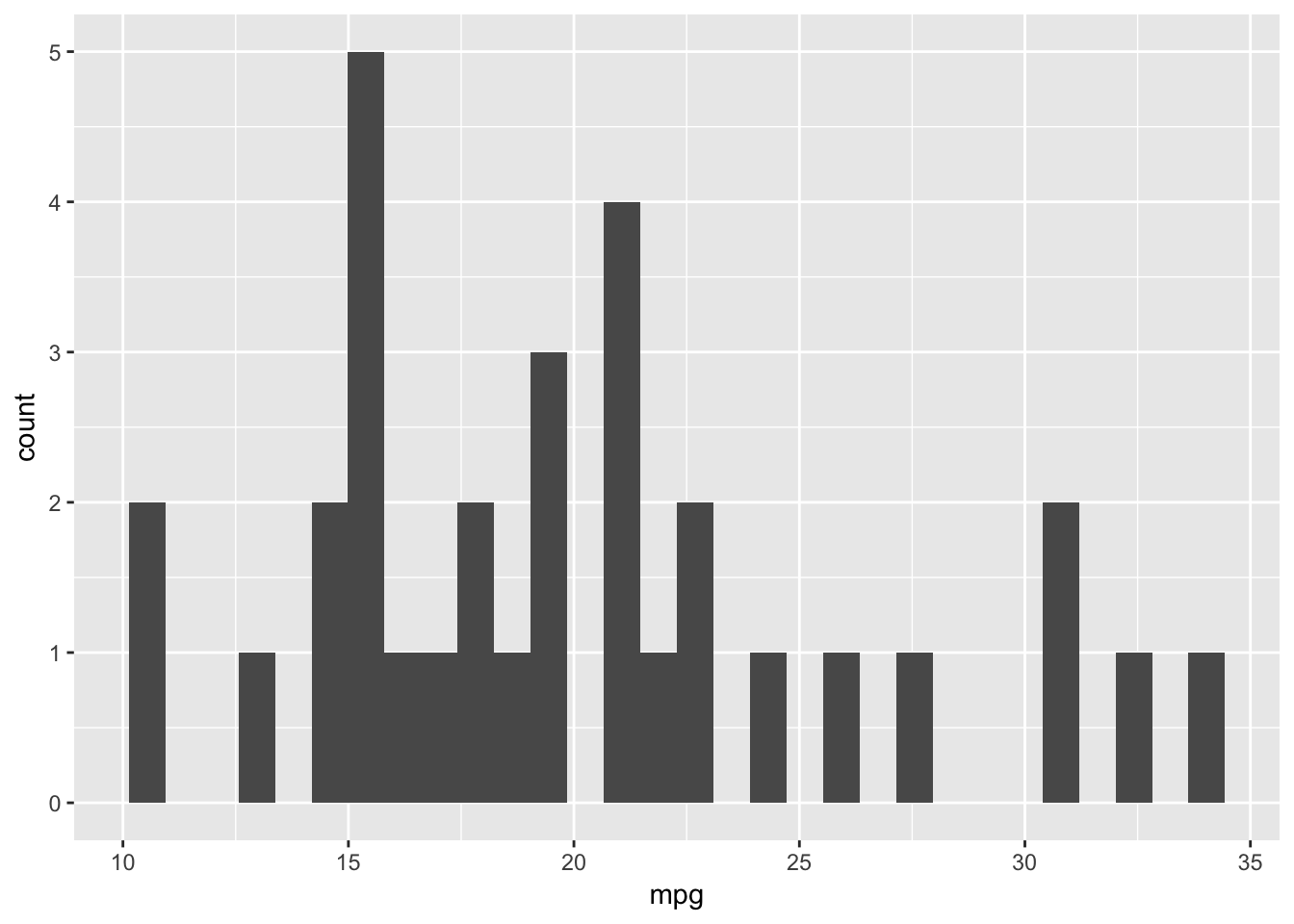
The message from the geom when you run this code illustrates this point - it says stat_bin() using bins = 30. Pick better value with binwidth.
In geom_point() binwidth was not a parameter but it is in geom_histogram(). Let us look at a different binwidth which is used to determine the range over which we count and as such the number of bins:
ggplot(data=plottingData)+
  geom_histogram(aes(x=mpg),binwidth=4)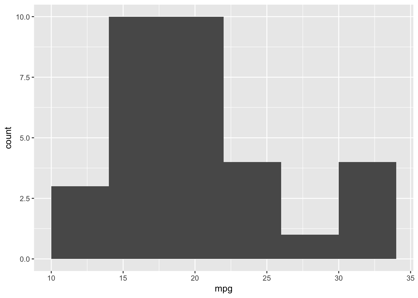
We could also specify the number of bins and change the aesthetics similarly to before:
ggplot(data=plottingData)+
  geom_histogram(aes(x=mpg),fill='#BD0026',colour='black',bins=5)
Previously our data has been able to be directly used within our geoms, we shall now look at how to create a barplot where this is not always the case.
Barplot Single Variable
Let us create a barplot which is the number of cars with different cylinder types. As before we are going to need to change cyl into a factor so that the x axis is not a continuous range.
ggplot(plottingData)+
  geom_bar(aes(x=as.factor(cyl)))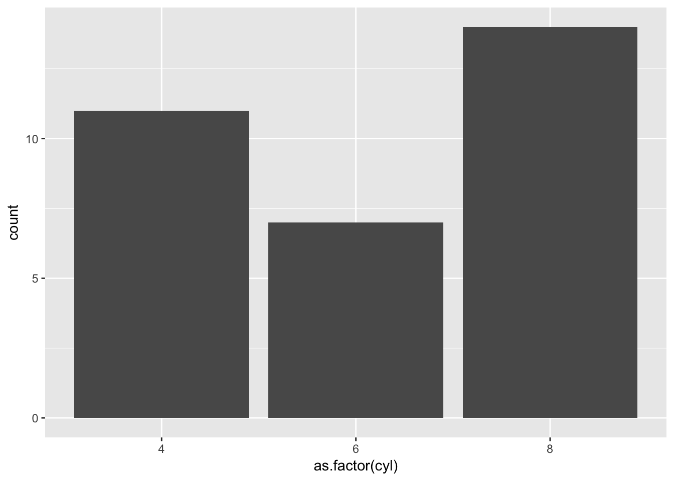
Straightforward enough, but what if we want a barplot where the average mpg is on the y axis for each cylinder type? Our data doesn’t contain that. For us to plot this we want to reduce our data frame from 32 rows to 3, as we will have one value for average mpg for each cylinder.
In the previous post we introduced the mutate() function within dplyr, let us introduce two more verbs which will enable us to get the data we want.
dplyr: group_by
Within dplyr we can create a data structure with groups using group_by(), after the group_by() statement subsequent verbs are performed on each group. For example:
plottingData %>%
  group_by(cyl) %>%
  mutate(avgMPG=mean(mpg)) %>%
  select(cyl,mpg,avgMPG) %>%
  head
## # A tibble: 6 x 3
## # Groups: cyl [3]
## cyl mpg avgMPG
## <dbl> <dbl> <dbl>
## 1 6.00 21.0 19.7
## 2 6.00 21.0 19.7
## 3 4.00 22.8 26.7
## 4 6.00 21.4 19.7
## 5 8.00 18.7 15.1
## 6 6.00 18.1 19.7The value of avgMPG is the same for each value of cylinder, however we still have the same number of rows. We could create a statement like this to get only one avgMPG value per cylinder:
plottingData %>%
  group_by(cyl) %>%
  mutate(avgMPG=mean(mpg),
         location=1:n())%>%
  filter(location==1)%>%
  select(cyl,avgMPG)
## # A tibble: 3 x 2
## # Groups: cyl [3]
## cyl avgMPG
## <dbl> <dbl>
## 1 6.00 19.7
## 2 4.00 26.7
## 3 8.00 15.1However that is convoluted and messy, we can use another verb instead which does this automatically.
dplyr: summarise
Summarise is similar to mutate however it not only reduces the rows in the data frame but also the columns keeping only grouping variables and variables created by summarise.
plottingData %>%
  group_by(cyl) %>%
  summarise('avgMPG'=mean(mpg))
## # A tibble: 3 x 2
## cyl avgMPG
## <dbl> <dbl>
## 1 4.00 26.7
## 2 6.00 19.7
## 3 8.00 15.1Barplot Multiple Variables
Let us store the previous sentence in a variable and create the barplot we described:
barplotData <- plottingData %>%
  group_by(cyl) %>%
  summarise('avgMPG'=mean(mpg))
ggplot(barplotData)+
geom_bar(aes(x=as.factor(cyl),y=avgMPG))## Error: stat_count() must not be used with a y aesthetic.But there is a problem, the default parameters of geom_barplot do not allow a y aesthetic. We need to change the stat parameter. The online support around ggplot is extensive, if you google the error the first page of results gives the solution below.
ggplot(barplotData)+
  geom_bar(aes(x=as.factor(cyl),y=avgMPG),stat='identity')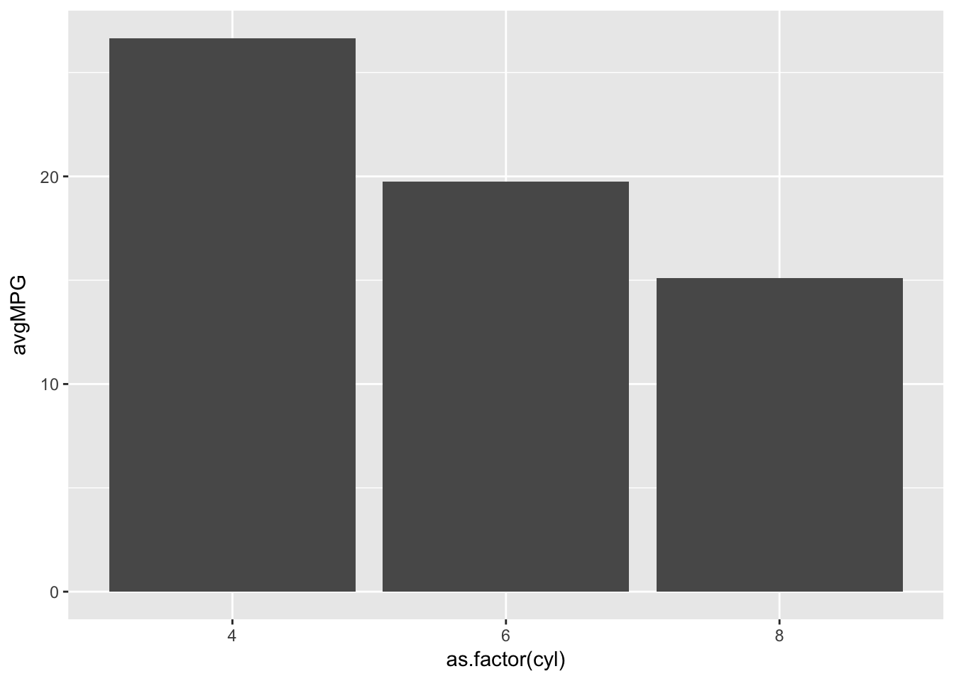
What if we want to add a fill to our barplot. We can create the data frame easily enough through a combination of grouping variables, and using fill in geom_bar() we can see the breakdown for each cylinder by gear.
barplotData <- plottingData %>%
  group_by(cyl,gear) %>%
  summarise('avgMPG'=mean(mpg))
ggplot(barplotData)+
geom_bar(aes(x=as.factor(cyl),y=avgMPG,fill=as.factor(gear)),stat='identity')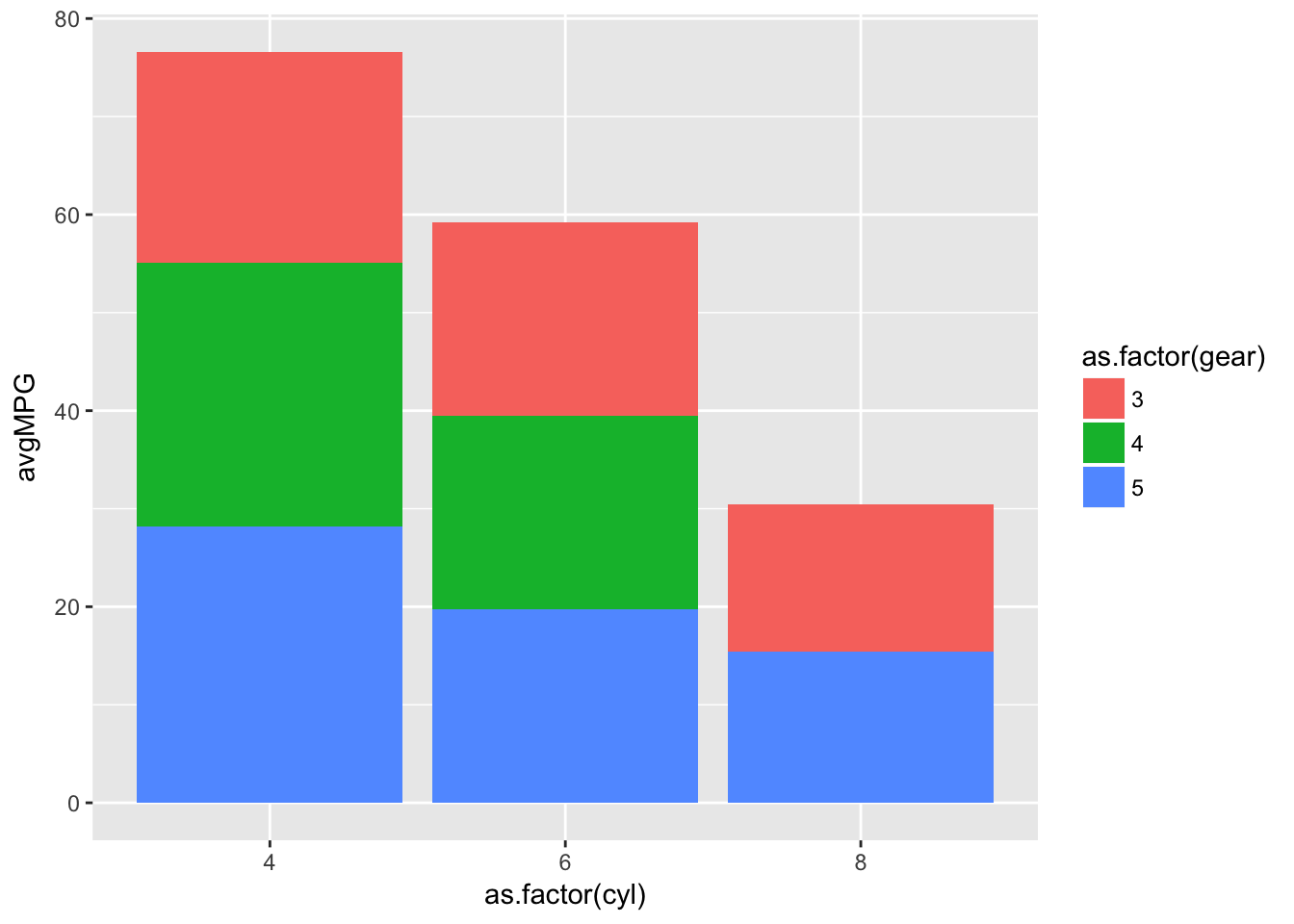
However a stacked bar chart is not always the most useful at identifying differences, what if we want the bars side by side? We can specify the position within geom_bar() as either “dodge” or “stack”:
ggplot(barplotData)+
  geom_bar(aes(x=as.factor(cyl),y=avgMPG,fill=as.factor(gear)),stat='identity',position='dodge')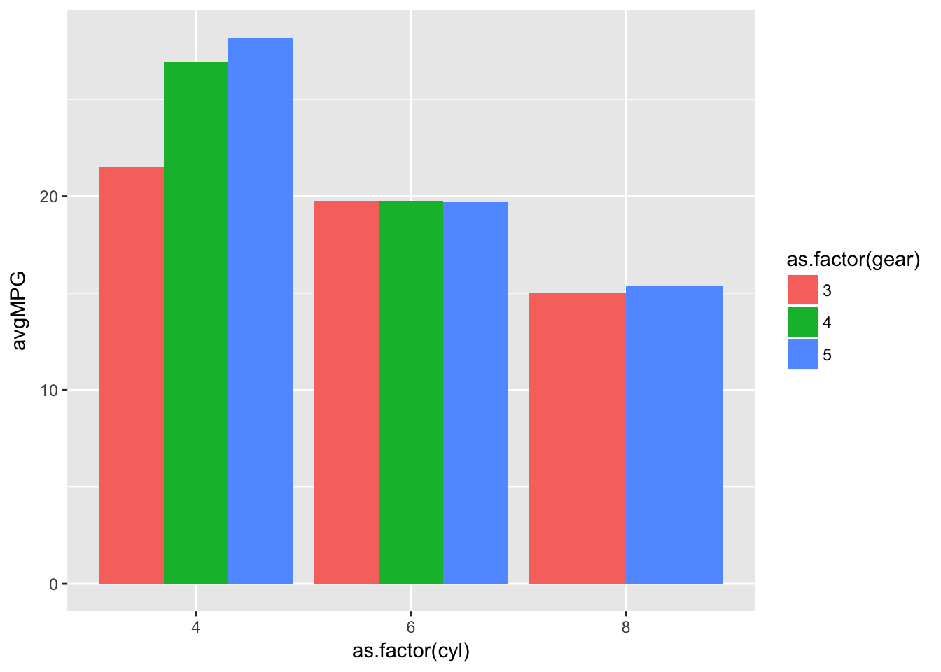
We haven’t covered all the functionality of ggplot in this post because it would be a series in and of itself. However as shown there are resources available online that will provide an answer to most queries and some great books that are available too.
Data structure
So far the data has been in the correct format for ggplot to use - the so called “tidy” format. The alternative table, or “wide”, format is:
## # A tibble: 3 x 4
## # Groups:   cyl [3]
##     cyl   `3`   `4`   `5`
##   <dbl> <dbl> <dbl> <dbl>
## 1  4.00  21.5  26.9  28.2
## 2  6.00  19.8  19.8  19.7
## 3  8.00  15.0   0    15.4
We can convert data from tidy to table and vice versa using verbs from another tiyverse package tidyr gather() and spread().
tidyr: spread
They verb spread() takes two columns and spreads the data frame according to one using the values of the other to fill in the data structure. We can specify what to fill the data frame with in case of missing variables too. The general structure is:
spread(DATA,COLUMN,VALUES)So in the table above we spread barplotData by gear using the values of avgMPG and in case of missing values we filled with 0.
tableData <- barplotData %>%
  spread(gear,avgMPG,fill=0)
With spread() we can transform data structures into a tabular format. The complimentary function gather will get the data from a table format to a tidy format.
tidyr: gather
The verb gather() takes a set of columns and flattens them into the tidy format with the general form:
gather(`KEY COLUMN NAME`,`VALUE COLUMN NAME`,COLUMNS)Within gather() we specify the name of the column that contains the current column names, and what name to give the column containing the values. We then need to specify which columns to use, we can do so by specifying column locations or names as well as by telling gather() which colums we don’t want to be affected. This can be done with either column locations or column names as we will demonstrate now.
tidied <- tableData %>%
  gather('gear','avgMPG',2:4)
tidied <- tableData %>%
  gather('gear','avgMPG',-1)
tidied <- tableData %>%
  gather('gear','avgMPG',-cyl)
## # A tibble: 9 x 3
## # Groups: cyl [3]
## cyl gear avgMPG
## <dbl> <chr> <dbl>
## 1 4.00 3 21.5
## 2 6.00 3 19.8
## 3 8.00 3 15.0
## 4 4.00 4 26.9
## 5 6.00 4 19.8
## 6 8.00 4 0
## 7 4.00 5 28.2
## 8 6.00 5 19.7
## 9 8.00 5 15.4We can then put our variable tidied into a ggplot graph.
tidiedGraph <- ggplot(tidied)+
  geom_bar(aes(x=as.factor(cyl),y=avgMPG,fill=as.factor(gear)),stat='identity',position='dodge')
tidiedGraph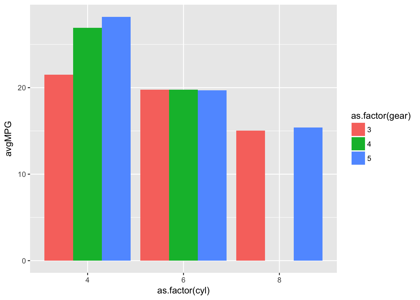
You will notice in the previous graph we have a space in cyl=8 because there are no 4 gear cars with 8 cylinders. This now makes each bar equal in width with the inclusion of a 0 in the missing grouping, which was an issue with the previous plot.
Interactive Plots
## Warning: package 'plotly' was built under R version 3.4.1We can not only create static charts within R but with a slight change in syntax we can create interactive plots too. Whilst we will introduce them here they will be left for either a later post or for self discovery.
Plotly
We introduce plotly first because we have already created the base of an interactive plot in this post. Within the plotly library there is a function that converts a ggplot graph into an interactive chart.
ggplotly(tidiedGraph)There are some formatting problems but the core point is an interactive graph created with minimal effort.
rbokeh
The package rbokeh is an R interface to the bokeh visualisation library which is available on multiple platforms. Similarly to ggplot figures are built in layers with figure() replacing ggplot() and ly_ replacing geom_. If we wanted to build our cylinder/gear barchart we can do so with the following code.
bokehPlot <- figure(tidied) %>%
  ly_bar(x=as.factor(cyl),y=avgMPG,color=as.factor(gear),position='dodge',hover=TRUE)
bokehPlot
That’s not all…
We have just scratched the surface of the potential within R for visualisation. Not only can we create interactive visualisations but we can build interactive reports too. Dashboards can be built using shiny and even websites with Markdown - in fact this website is built in R Markdown.
Code, Problems, and Solutions
Once again we have covered a lot of ground in this post, and the problems available here are good practice to reinforce the points covered. There are many available test data sets with which you can practice visualisation and again I encourage you to do so. This post’s problems culminate with a challenge which will be a test of your problem solving capabilities.
About “Err… to R!” posts
The general desire to learn a programming language is increasing. Whilst R has a fairly steep learning curve in comparison to other languages, it was designed to analyse data. Once you take into account CRAN, R is one of the most powerful analytics tools available. The goal of this course is to get you comfortable using R, and the way in which it shall be presented is such that you can hopefully learn another language - if wanted/needed - quickly as the way in which the material is presented is designed to help you understand how to learn a programming language; not just how to learn R.

Share this post
Twitter
Google+
Facebook
Reddit
LinkedIn
StumbleUpon
Email